Turn Storytelling Into Strategy. Turn 2026今日简报:极速168赛车体彩赛果查询官网 Into Sales.
Most businesses think they have a marketing problem. What they really have is a disconnect problem.
Customers don’t follow funnels. They follow stories. Their own, not yours. Every click, hesitation, and neglected followup is part of a journey you either understand and optimize or ignore and lose.
That’s where Buyer Legends comes in.
This isn’t just another marketing framework. It is a business process that uses storytelling as strategy. We don’t guess what customers should do. We map what they actually do. We turn their journey into a clear, compelling, and actionable narrative that aligns brand intent with customer reality.
- Stories that reveal the invisible. What’s working, what’s broken, and why buyers bail.
- A journey map that everyone understands. From the boardroom to the stockroom.
- Marketing, sales, and customer experience finally in sync. What you promise is what customers experience.
This is how you fix the friction, remove the gaps, and turn intention into action. Because when your story and the customer’s story align, the sale is already made.
- You’re Worth More Than You Think
 How Mindset, Value, and the Words We Use Shape Everything At the beginning of a new year, we tend to do the same thing. We set goals. We make plans. We talk about growth, improvement, and momentum. But before any of that matters, there is a more important place to…
 - Why Stories, Not Features, Drive Growth
 If your customers don’t feel the story, they won’t fund the solution. The most overlooked growth lever in your business isn’t your product. It’s how you frame what it means. Most product narratives follow a tired script: “It’s faster. It’s smarter. It’s better. It does more.” That’s not a story.…
 - The Weight of Smart
 The inventor was tired. Not the kind of tired a nap fixes. The kind that hums behind your eyes. The kind that lives in your calendar. The kind that builds up when what you build keeps getting ignored. His workshop was full. His head was fuller. Like a browser with…
 - The 3 Storytelling Mistakes That Are Silently Killing Your Sales
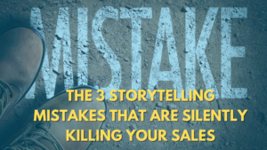 We’re hardwired for story. Our brains crave it. And yet, every day, sales and sales enablement teams are stuck trying to sell with slides and stats instead of stories that make customers feel something. Let’s be honest. People don’t buy because of your data, even in the most technical of…
 - 极速168一分钟赛车全新的体彩
 How a Simple T-Shirt Turned Into a Movement in Round Rock Every town has its storytellers. Round Rock has its own rhythm and its own voice. If you have been paying attention, it also has real momentum. It is not +全国最快赛车1分钟历史赛果75秒一期查询 growing, it is booming. In six years, Williamson County’s…
 - Simplicity Is Mastery: Why Clear Messages Win Minds, Hearts, and Markets
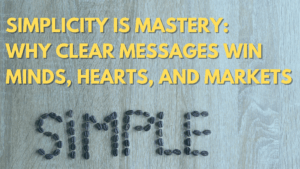 There’s a moment, often too late, when people realize their message didn’t land. It didn’t inspire, convert, or persuade. And they can’t quite figure out why. It wasn’t the idea. It wasn’t the effort. It was the excess. Too many words. Too much complexity. Not enough clarity. We live in…
 - Big Tech Wants You To Build a Funnel; Not a Brand
 Now the Funnel Is Dying. Only Your Story Can Save You. They sold you the dream. Big Tech promised that if you could track it, you could control it. That with enough dashboards, pixels, retargeting, and funnels, you could build something that lasts. But what they never told you is…
 - AI Can’t Fix a Broken Story (But True Leaders Can)
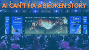 Even the most intelligent AI can’t fix a broken story. And it can’t replace a team that doesn’t believe the same thing. After thirty years helping companies optimize conversions and build persuasive systems, we’ve seen one truth show up again and again: The right message always wins. Not the best…
 - The SEO Funnel Is Dead
 A few years ago, if you wanted the best chicken soup recipe, you typed it into Google. You’d hit enter and brace yourself. First, you’d scroll past ads. Then you’d land on a blog post about someone’s grandmother. You’d dodge pop-ups, wait for autoplay videos to stop, skim through 1,500…
 - The Hidden Structure Behind Every Story That Sells
 What if I told you the difference between words that get ignored and words that change lives comes down to just two words? Not “once upon.” Not “the end.” Two little connectors that most people overlook: ‘but’ and ‘therefore’. Stay with me because this is the hinge between someone forgetting…
 - What a Press Release Taught Me About the Future of Marketing
 Frustrated at waiting for Google to update their index, I recently ran a simple experiment. I wrote a press release, published it, and watched as AI models like ChatGPT and Gemini instantly treated it as fact. Think about that for a moment. A single piece of content became the “truth”…
 - Why the Stories Inside Your Company Are Your Best Customer Experience (CX) Tool
 When we talk about customer experience (CX), it’s easy to focus on the outward stuff: the slick interfaces, the polished training, the customer-facing slogans. But let’s zoom in a bit further. The real magic of a memorable customer experience actually starts with the stories your team believes internally. These internal…
 - The Hidden Truth About Building a Remarkable Business With John Garrett of Community Impact
 What separates the businesses that last from the ones that flame out? It’s not branding. It’s not hustle. It’s not even timing. It’s conviction. That’s what I walked away with after sitting down with John Garrett, founder of Community Impact, on my Rock Solid podcast. His story isn’t just impressive.…
 - The Underdog Advantage: Why Playmaker Recruiting Won Startup Day
 Five minutes. One stage. No second chances. That was the challenge at the Round Rock Chamber‘s Startup Day pitch competition. And that‘s where Joseph Fischer, founder of Playmaker Recruiting, stood out and won. Why his story connected Joseph didn‘t start with features or numbers. He started with his own story,…